In central Virginia, few brands are more revered than Ukrop’s. With over 70 years of history, the iconic name and logo is synonymous with quality foods that are perfect for sharing with family and friends.
However, modern grocery environments–and increasingly cluttered shelves with an ever-growing list of competitors–created a new challenge for this brand: how can it capitalize on its history, while also breaking through at retail?
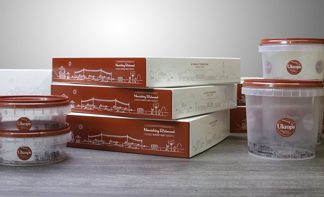
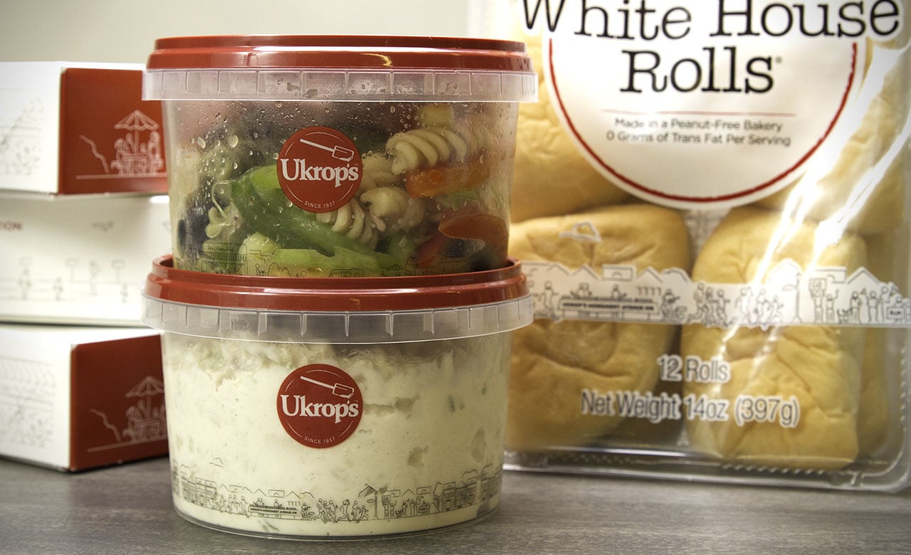
Elevation conducted a comprehensive packaging review and competitive analysis that led to the introduction of a new, dominant packaging color for Ukrop’s. The deep red tone we introduced stands out on the shelf and creates a quick visual shortcut for consumers in both the bakery and prepared foods sections of the store. Most importantly, we focused on Ukrop’s status as a “hometown brand” by covering the packaging in custom illustrations of hometown scenes. The result is a new approach to Ukrop’s packaging that leverages the past while moving boldly into the future.


