Ever heard of novel Cas9 enzymes and CRISPR genome editing? Chances are the answer is “no,” and that makes you no different than most consumers in the produce section of a grocery store.
Pairwise, a pioneering fruits and vegetables start-up in North Carolina’s Research Triangle, faced a particularly thorny challenge: how to highlight their advanced gene editing technology to attract investors and food companies in the short-term, but also make their products appeal to future consumers.
In order to bring their brand to life, we had to establish the mission: to create a healthier world through better fruits and vegetables. As in, more palatable greens. Berries without the seeds. Cherries without the pits. All natural, all delicious.
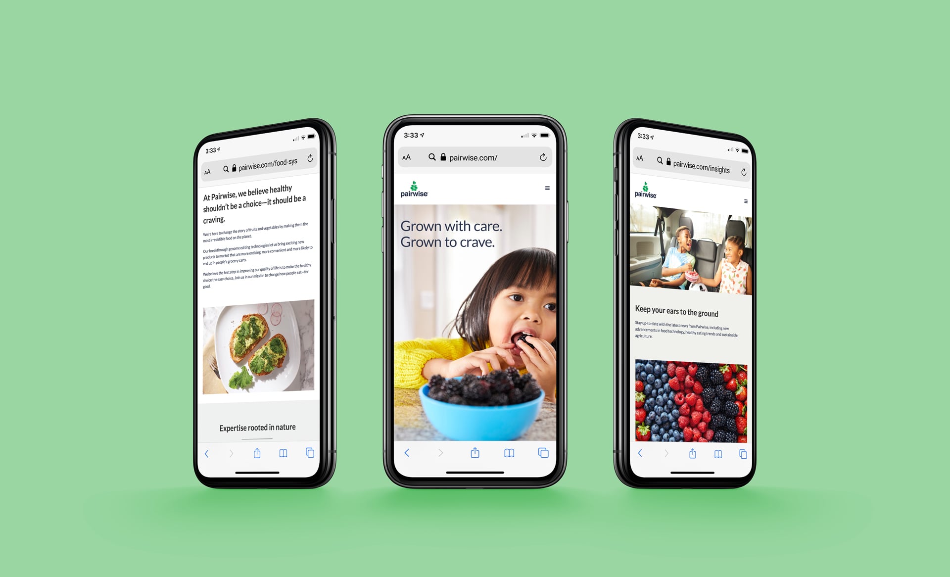
The brand promise was born: Grown with Care. Grown to Crave. This allowed us to speak to both the pioneering breeding technology, but also the irresistible flavors of Pairwise products.
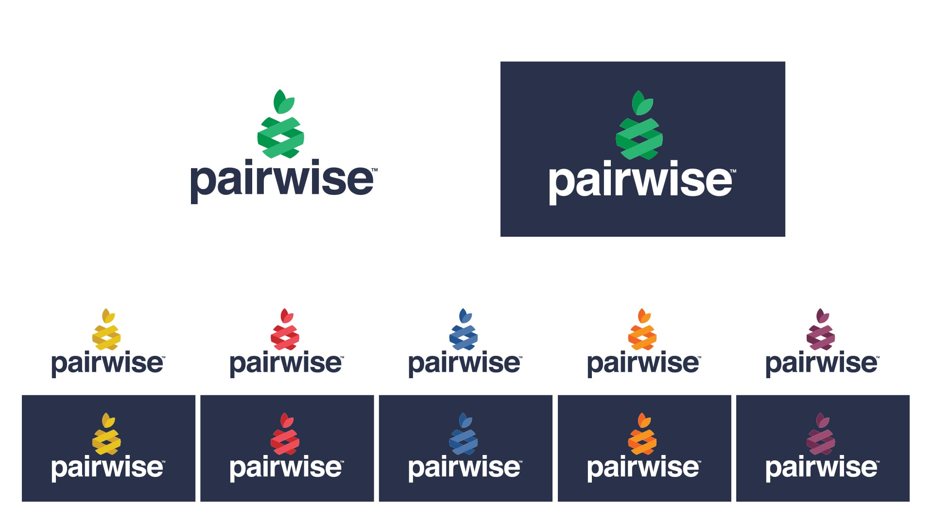
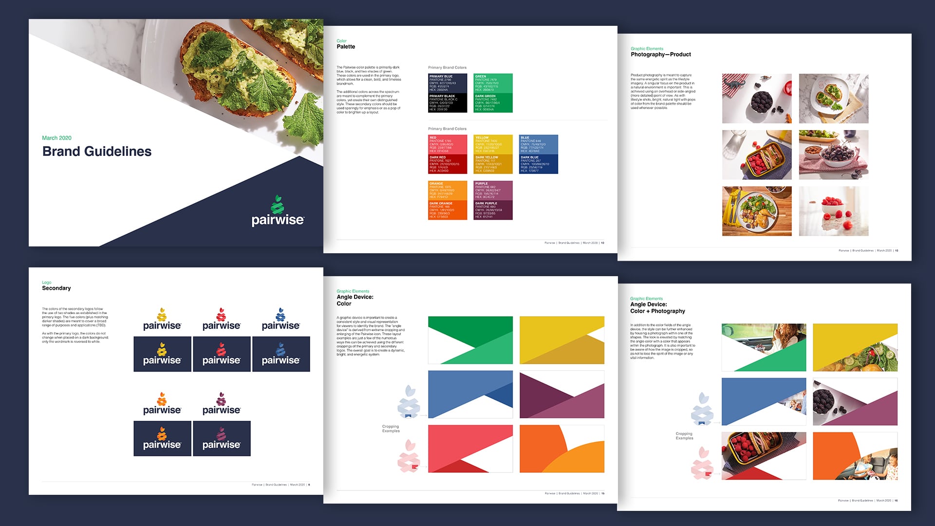
This duality was carried throughout their visual identity, starting with a mark inspired by the double helix of DNA, and playfully shaped into fruit. To allow the brand to speak to a wide variety of products as the company grew, we went a step further to create a secondary color system for the logo that included red, purple, orange, blue and yellow. Photography capturing authentic snacking moments infused the brand with humanity—all coming together in a website that feels fun, bold and relatable and makes people want to eat their fruits and veggies.
Because at the end of the day, healthy shouldn’t be a choice—-it should be a craving.


