Here’s a challenge: a beloved brand that’s been in business since the 1800s needs to update its look. The new design needs to appeal to younger audiences, while not alienating longtime, core customers. The solution needs to be fresh, modern and bold enough to stand out on overcrowded store shelves, yet flexible enough to work across a huge line of diverse products.
Oh, and the design solution also needs to work on labels for small packages. Like, postage-stamp small.
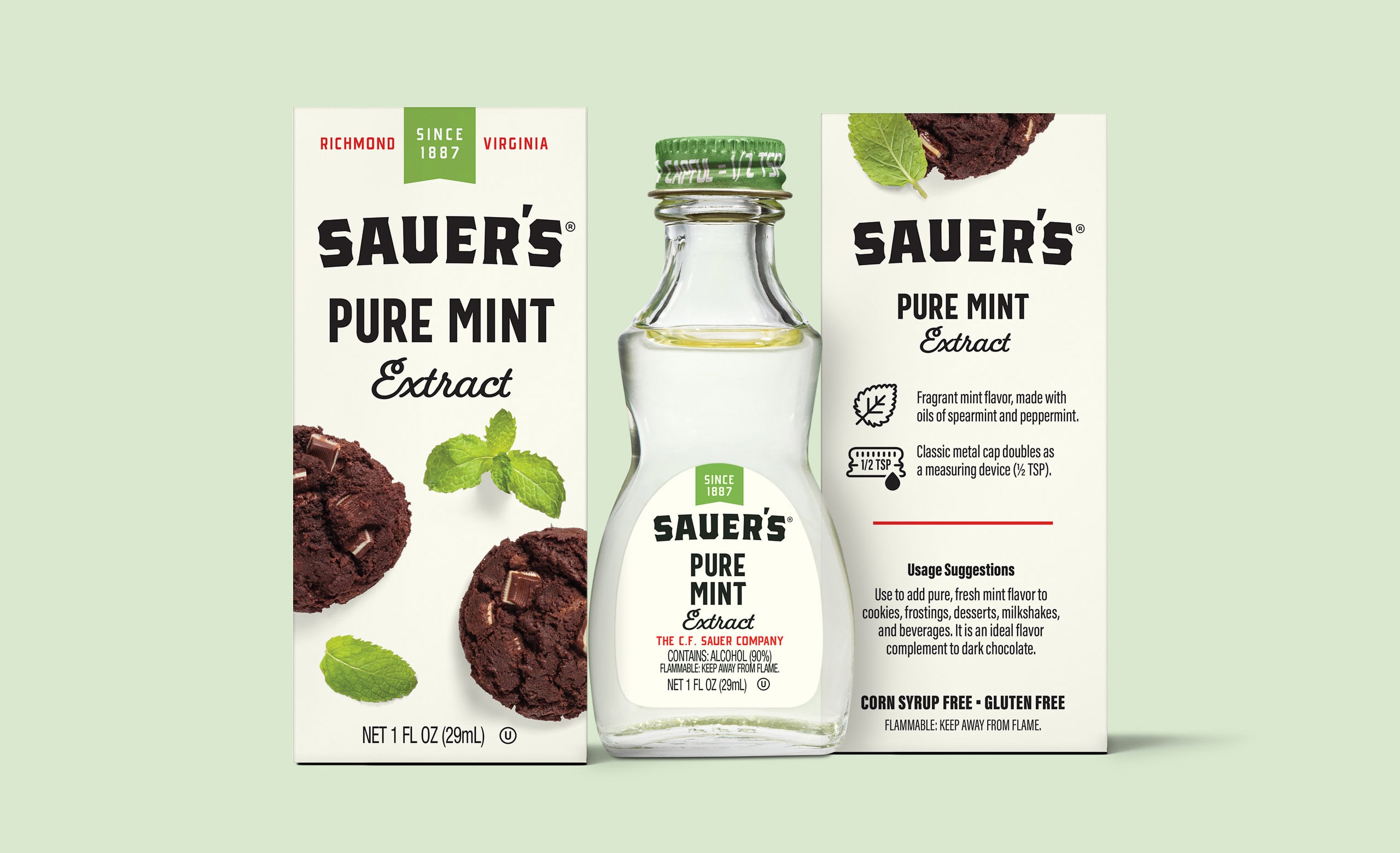
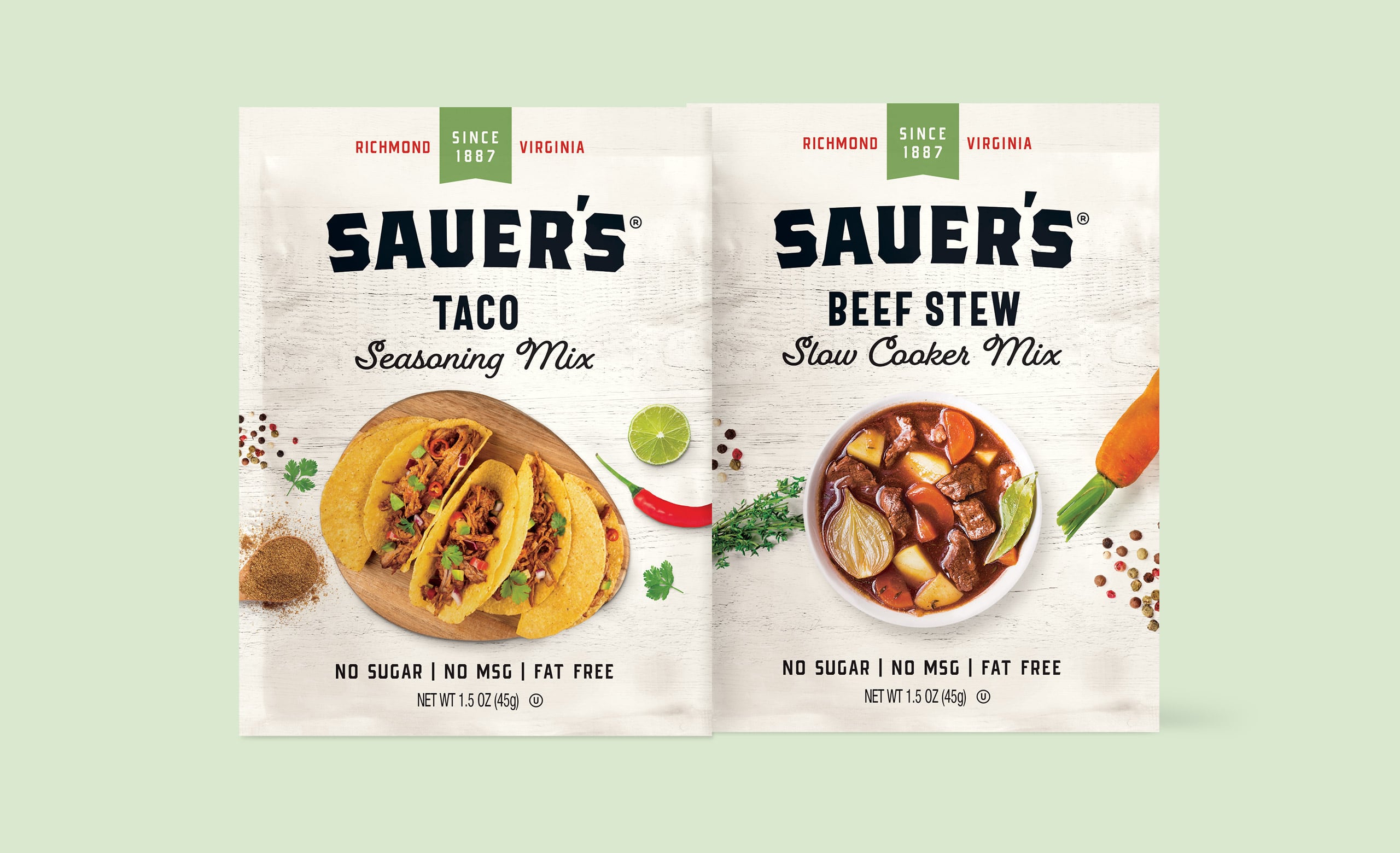
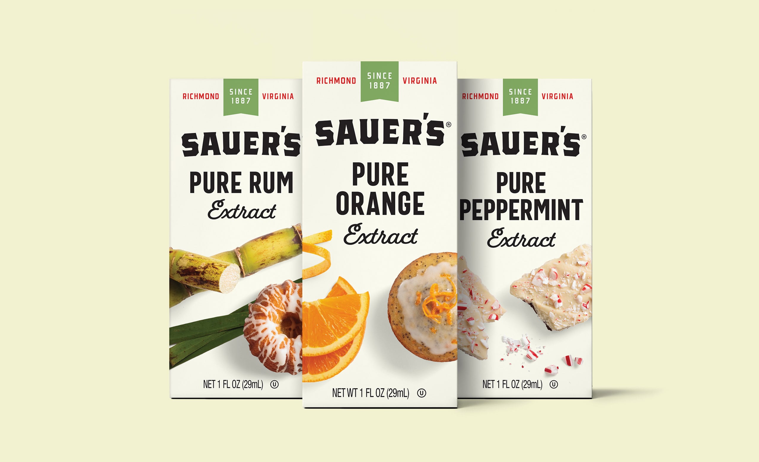
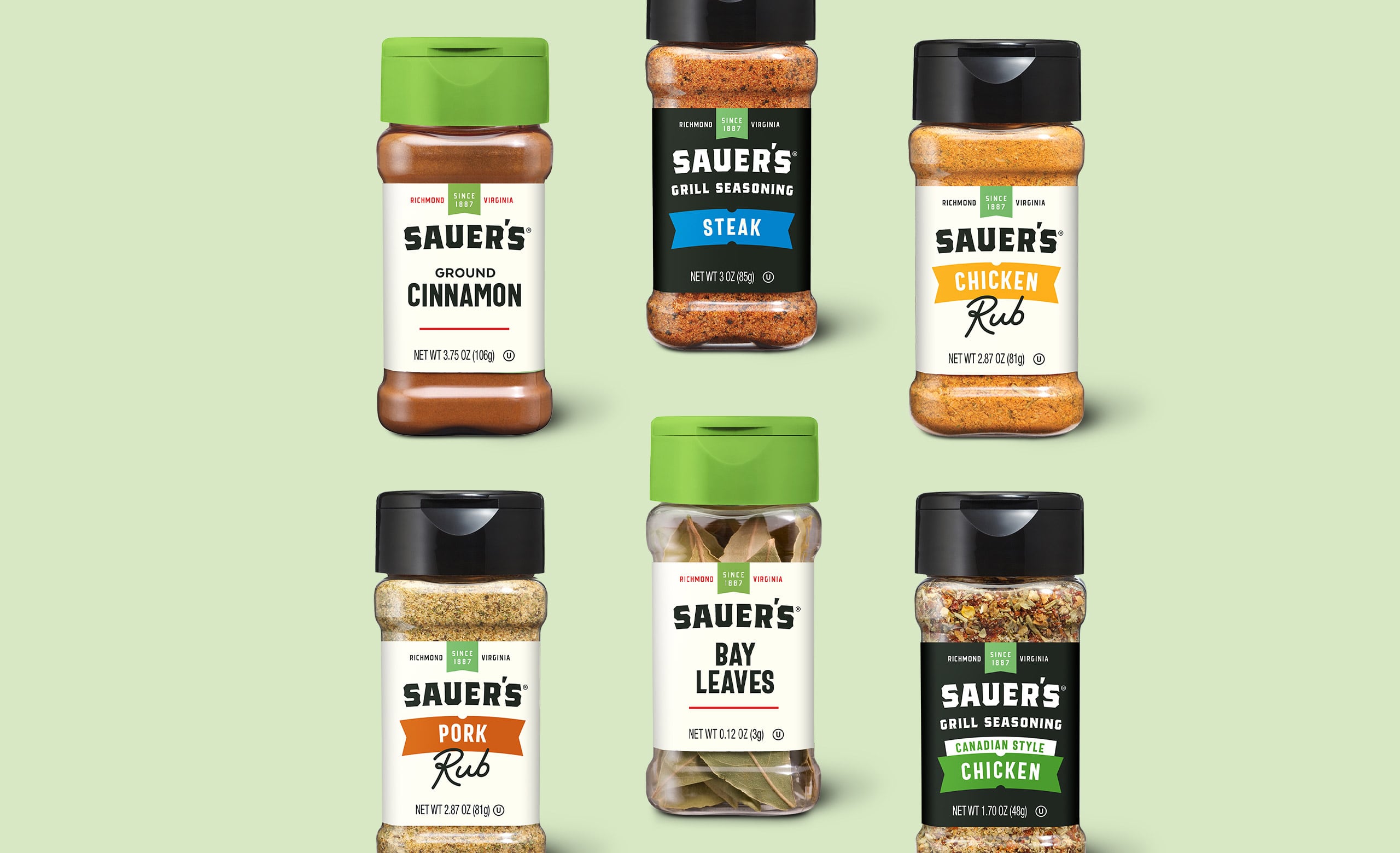
That was the case for Sauer Brands—the 130-year old flavoring company known for its spices, extracts, rubs, seasoning mixes, gravies and condiments. After several rounds of prototyping, we developed an approach guided by two elements: clarity and visual impact. The design system features bold type and a unique lid color that gives the brand a strong presence in the highly-competitive spice aisle.
But the system does much more than just attract customers’ eyes. The packaging has a clear hierarchy of information, making it easier for consumers to quickly find what they need. Where possible, we added food photography to increase engagement and add appetite appeal that would inspire at-home chefs. And we redesigned the corporate logo to pay honor to the company’s long history, while improving legibility on shelf.
The overall effect of the new branding gives the packaging a premium feel that’s worthy of the quality products Sauer’s offers. We’ve applied the design system to more than 200 individual SKUs thus far.